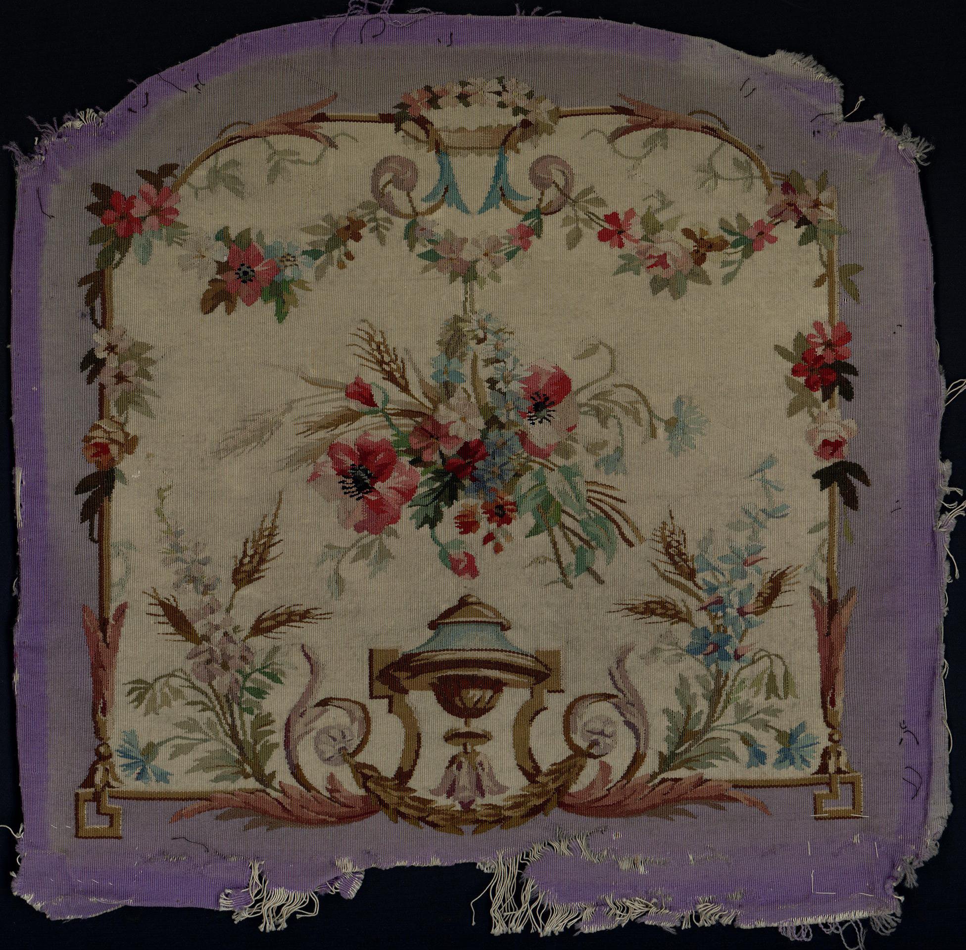
Origin: France
Date: second half of the 18th century
Material: wool, silk
Technique: tapestry weaving
Dimensions: height 78 cm; width 70 cm
Current Collection: The State Hermitage Museum
Inventory Number: T-15720
Hermitage ID: 488818
Rudanovsky Connection: Entered the Hermitage in 1919 from the collection of A. K. Rudanovsky.
A tapestry cover for a chair seat from the second half of the eighteenth century, with a tall bouquet of iris, tulip, roses and anemones rising from a scroll base.
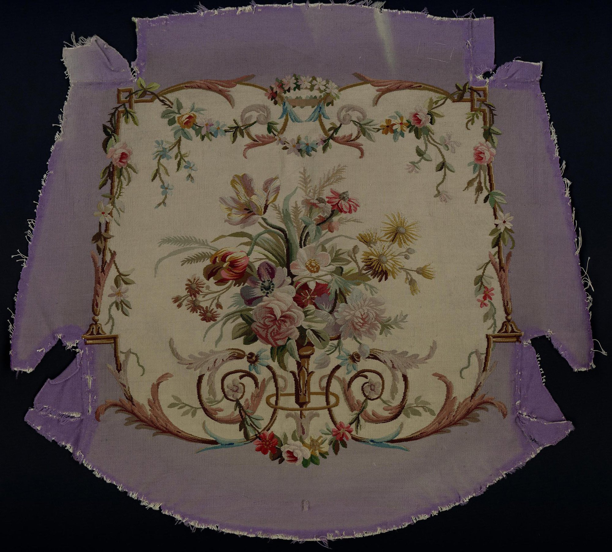
Tapestry: Upholstery for a Chair Seat (T-15720). The State Hermitage Museum.
The cover comes from the collection of A. K. Rudanovsky and entered the Hermitage through the Department for the Protection of Monuments. It is not currently on permanent display.
It belongs to the group of tapestry covers for a sofa and chairs that entered the museum together: the same cream ground, the same lilac border, the same scrollwork, the same garland along the top. Within that group, this panel is distinguished by the height of its bouquet and by the presence of an iris, which gives the composition a strong vertical axis.
The Object
The field is cream, softly modulated, with the faint horizontal grain of the weave. The bouquet rises from a gilded scroll base in the lower centre and reaches almost to the garland at the top.
At the top of the bouquet stands a tall iris, its petals folded and drooping in the manner of the period. Below it, a tulip leans to the left, its petals striped in red and cream. Roses and anemones fill the middle: full pink blooms, a dark crimson anemone with a black centre, smaller buds and clustering flowers. Daisies, ferns and feathery leaves spread to either side.
Along the upper edge runs a garland of roses and small blossoms, dipping in the centre, where a wreath is tied with a blue ribbon. A border of lilac silk frames the tapestry.
The Iris and the Tulip
The iris is the tallest flower in the bouquet, and it sets the tone of the whole design.
In eighteenth-century floral ornament the iris carried associations of majesty and eloquence, but its main value to the designer was formal: it provided a vertical stem, a cluster of folded petals and a cool note of blue-violet in a warm palette.
The tulip beside it performs the opposite function. It leans, opens and turns, breaking the vertical line and introducing the broken, feathered colour that had been prized in tulips since the seventeenth century. The two flowers together create a contrast of posture — one upright, one inclined — that gives the bouquet its movement.
The roses and anemones supply mass and depth. The anemone, with its dark centre and bright petals, is the strongest accent in the composition; the roses are softer and more numerous, and they carry the transitions of tone from crimson to pale pink.
The Seat as a Format
A chair seat imposes a peculiar set of conditions on a design.
The panel is seen from above and at an angle, usually with a person sitting on it. It must read as a composition when the chair is empty and as a surface when the chair is in use. It must survive the abrasion of clothing, the pressure of the body and the light of a room.
The designer of this cover responds to those conditions by concentrating the ornament in the upper part of the field and keeping the lower part relatively open. The bouquet rises from a base of scrolls that anchors it visually, and the garland frames the top edge, where the eye enters the composition.
The result is a design that works both as a picture and as a surface — decorative enough to be looked at, robust enough to be sat upon.
The Garland and the Wreath
The garland along the top of the panel is not a separate decoration but the upper edge of the design.
It dips at the centre, rises at the corners and carries a small wreath tied with a blue ribbon. The wreath marks the axis of the composition and provides a visual anchor for the tall bouquet below; the garland connects it to the corners of the panel and keeps the top edge from feeling empty.
Garlands of this kind were a standard element of eighteenth-century ornament, derived from antique festoons and adapted to the lighter, more playful taste of the Rococo. In tapestry they had an additional function: they softened the transition between the woven field and the carved wooden frame, and they allowed the design to end gracefully at the edge of the seat.
Flowers and the Seasons
The bouquet is a mixture of seasons.
Tulips and irises belong to the spring; roses and anemones to the summer; the wheat and grasses of the companion panels to late summer and autumn. In a single composition the designer combines flowers that would never bloom at the same moment.
This is a convention of decorative art rather than a mistake. The bouquet is not a record of a particular day but an image of perpetual flowering, an ideal garden in which the seasons coexist. The same convention governs the flower pieces of the period, where spring, summer and autumn blooms are arranged together in a vase.
For the owner of the chair, the bouquet was a permanent spring: a surface that stayed in flower while the real garden outside changed and faded.
The Scroll Base
The gilded scrolls at the bottom of the bouquet are more than a decorative support.
They belong to the Rococo vocabulary of cartouches, shells and curling tendrils, and they perform the same function as the carved giltwood frame of the chair: they give the design a base, a transition between the woven flowers and the wooden rail.
The scrolls are woven in olive, gold and pale brown, with small touches of blue and pink in the leaves. They are lighter in tone than the bouquet, so that the flowers remain the centre of attention, but they are drawn with care: the curls turn, the leaves overlap, and the whole base has a sculptural quality that echoes the carving of the frame.
The Palette
The colours of the cover are those of the eighteenth-century dye house, worked into a restricted and harmonious scheme.
The reds range from the deep crimson of the anemone to the pale pink of the roses; the blues from the violet of the iris to the pale blue of the ribbon; the greens from olive to a cool grey-green in the fern-like leaves. The cream ground holds everything together and gives the colours a light, airy quality.
Tapestry colour is not mixed on a palette but selected from dyed threads. The weaver builds transitions by placing one tone beside another, and the eye completes the blend at a distance. This is why the surface of a good tapestry seems to shimmer: it is made of hundreds of small decisions, each one a thread.
Provenance
The cover carries the inventory number T-15720 and entered the Hermitage through the Department for the Protection of Monuments from the collection of A. K. Rudanovsky.
In the Hermitage
The cover is preserved in the State Hermitage Museum in Saint Petersburg and is not on permanent display.
Together with its companions, it allows the museum to reconstruct a furnishing scheme that no longer exists as furniture: the seats, the backs, the sofa, the garlands and the lilac borders that once made a single room. The reconstruction is partial, but it is enough to see how the eighteenth century thought about comfort and display at the same time.