Origin: France, Aubusson
Date: second half of the 18th century
Material: wool, silk
Technique: tapestry weaving
Dimensions: height 44 cm; width 48 cm
Current Collection: The State Hermitage Museum
Inventory Number: T-15728
Hermitage ID: 488826
Rudanovsky Connection: Entered the Hermitage in 1919 from the collection of A. K. Rudanovsky.
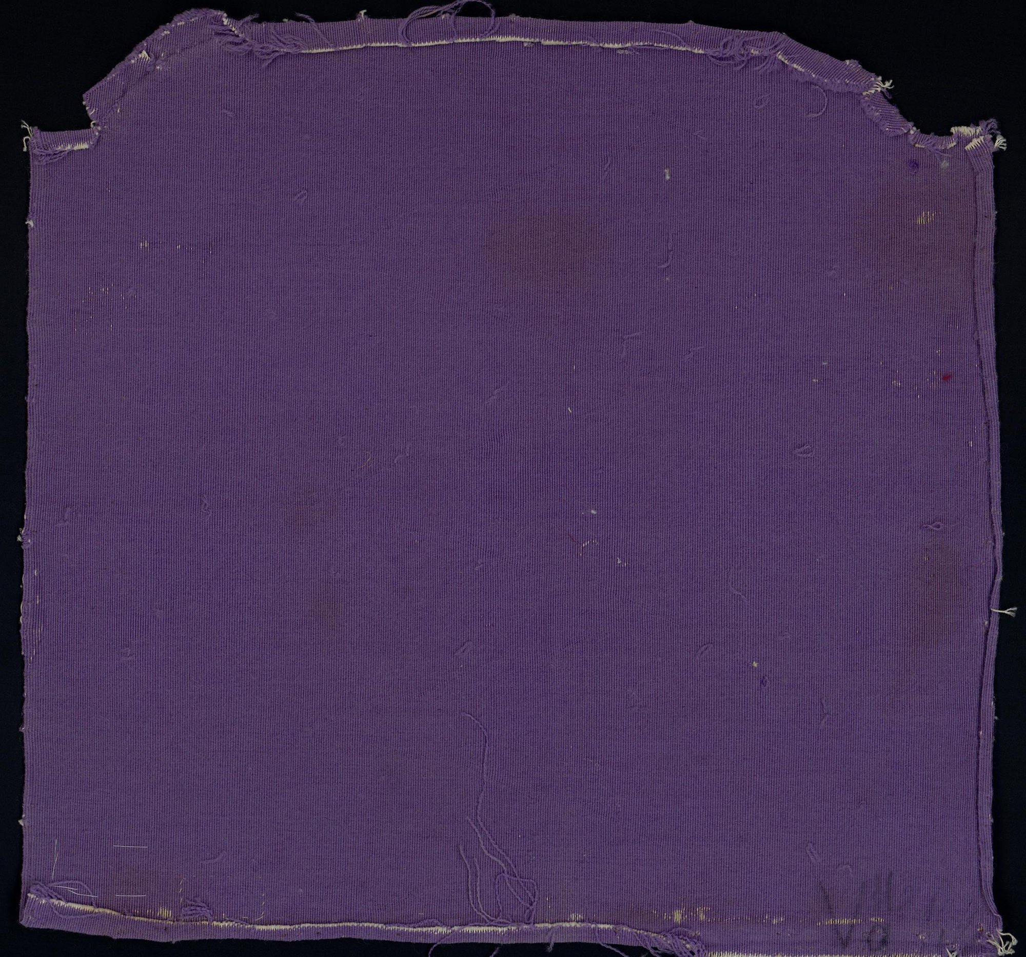
A plain lilac silk panel for the back of a chair, its colour faded to a soft grey-violet and its edges worn through.
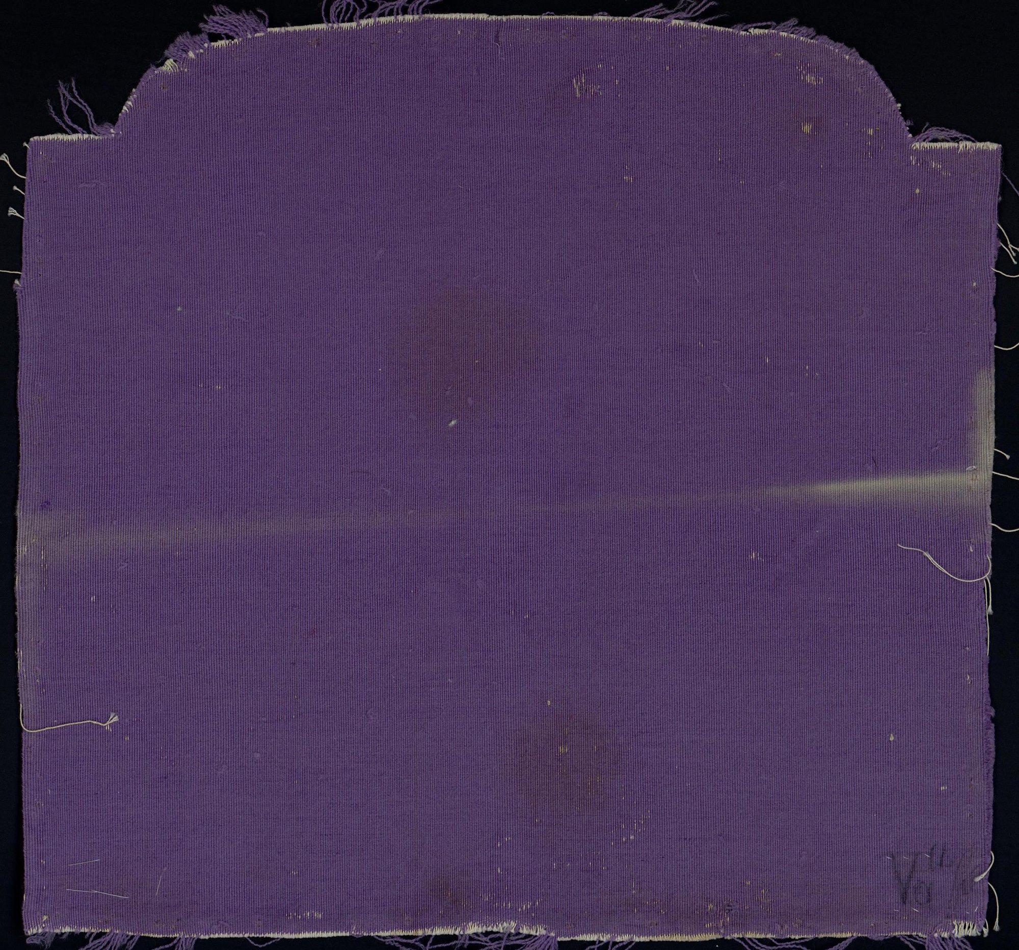
Tapestry: Upholstery for the Back of a Chair (T-15728). The State Hermitage Museum.
The panel comes from the collection of A. K. Rudanovsky and entered the Hermitage through the Department for the Protection of Monuments. It is not currently on permanent display.
It is one of a group of plain silk panels in the collection, all shaped for the backs of chairs and all in the same lilac tone. Together they represent the hidden side of the tapestry suite: the lining that closed the back of each chair and faced the wall.
The Object
The panel is a rectangle with a curved top and stepped shoulders, cut to the profile of a chair back. The surface is plain silk, closely woven, with a fine horizontal grain and a soft, slightly dusty sheen.
There is no design. The interest of the object lies entirely in its material, its colour and its condition: the way the silk catches the light, the way the colour shifts across the surface, the frayed edges and the loose threads that hang from the bottom.
The Colour Lilac
Lilac is a colour with a complicated history.
In the eighteenth century it belonged to the family of fashionable pale colours — the demi-teintes that replaced the saturated tones of the previous century. It appeared in silk, in porcelain, in painted furniture and in the borders of tapestries, and it was associated with refinement, intimacy and the interior.
The name comes from the flower, but the colour was achieved with dyes rather than with petals. Purple and violet could be obtained from orchil, a dye made from lichens, or by combining red and blue dyes — madder or cochineal with indigo. Each method produced a different tone, and each behaved differently in light.
The lilac of this panel is muted and slightly grey. It is not the clear, bright lilac of a modern dye; it is the colour of silk that has aged, and its unevenness is part of its character.
Dyeing Purple
Purple was one of the most difficult colours in the eighteenth-century dye house.
Orchil, the lichen dye, gave a range of purples and violets, but it was not particularly light-fast and tended to fade toward grey. Indigo overdyed with madder could produce a deep purple, but the result depended on the strength of the baths and the order of the operations. Cochineal with a tin mordant could give a brilliant crimson, and with an alkaline mordant a violet.
A dyer aiming at a fashionable pale lilac had to work with weak baths and careful timing. The colour was, in a sense, a colour of restraint: the paler it was, the more difficult it was to achieve evenly.
Fashion and the Interior
Lilac belongs to the taste of the later eighteenth century, and especially to the interiors of the 1770s and 1780s.
The colours of the period moved away from the deep reds and blues of the Baroque toward paler, cooler tones: grey, mauve, lilac, pale green, pearl. Walls were painted in these colours, furniture was upholstered in them, and silk hangings were dyed to match.
In this scheme, lilac was a colour of transition. It was cool enough to set off warm flowers, pale enough not to compete with them, and fashionable enough to signal that the owner was up to date.
Fading
The colour of the panel is not the colour it was.
Silk fades. The dyes used in the eighteenth century were sensitive to light, and the parts of a textile exposed to daylight lost their intensity long before the parts protected by a frame or a fold.
On this panel the fading is uneven. The centre is lighter than the edges, and there are patches where the colour has shifted toward grey. The pattern of fading is a record of how the object was displayed and stored: which side faced the light, which side lay against the chair.
Fading is usually treated as damage. In a textile like this, it is also a kind of documentation — a map of the object’s exposure to the world.
The Silk
The material itself is part of the object’s quality.
Silk was the most expensive fibre available to the eighteenth-century upholsterer. It was strong, fine and lustrous, and it took dye more brilliantly than wool or linen. A silk lining was a luxury, even on the back of a chair.
The weave of this panel is plain and regular, with a slight ribbing that catches the light in fine horizontal lines. At the edges, where the fabric has frayed, the individual threads are visible: pale, almost white, and very fine.
Silk in the Eighteenth Century
Silk was the luxury fibre of the eighteenth century, and its production was one of the great industries of Europe.
The main centres were Lyon in France, Spitalfields in London and, later, Krefeld and Vienna. Silk thread was reeled from the cocoons of the silkworm, thrown and twisted, and woven on drawlooms or plain looms. The finest silks were damasks and brocades; the plain silks, like this one, were the everyday luxury of the upholsterer’s trade.
A plain silk was cheaper than a figured one, but it was still expensive. It had to be woven evenly, dyed carefully and cut without waste. On a chair back, the silk was the least visible element of a costly object — and that is exactly what made it a marker of quality.
The Palette of Interiors
The lilac of the panel belongs to a particular moment in the history of interior colour.
In the 1770s and 1780s, the deep, saturated colours of the Baroque gave way to paler tones: pearl grey, pale green, straw yellow, lilac. Interiors were lighter, more intimate and more closely coordinated, with walls, curtains, upholstery and porcelain chosen in the same range of colours.
Lilac was one of the fashionable options. It was cool, slightly melancholy and very difficult to dye well, which made it a colour of discrimination. A room in lilac and cream, with giltwood furniture and a tapestry suite, would have been the height of late eighteenth-century taste.
The Luxury of Plainness
A plain silk is a paradox in a luxury object. It costs money without showing it.
The value is in the material itself — the fineness of the thread, the evenness of the weave, the depth of the dye — rather than in the labour of decoration. This is a particular kind of luxury, associated with the later eighteenth century: restrained, tactile, addressed to the hand rather than to the eye.
On the back of a chair, where it would be touched more often than seen, such a material made perfect sense.
Provenance
The panel carries the inventory number T-15728 and entered the Hermitage through the Department for the Protection of Monuments from the collection of A. K. Rudanovsky.
In the Hermitage
The panel is preserved in the State Hermitage Museum in Saint Petersburg and is not on permanent display.
It is an object that asks to be looked at slowly. At a glance it is a piece of old purple fabric; in fact it is a document of dyeing, weaving, upholstery and use, and its colour — faded, uneven, almost grey — is the most eloquent thing about it.